Services: Brand Strategy, Collateral Materials, Copyediting, Logo & Identity, Messaging, Naming, Photography, Signage, Tenant Gifts, Website
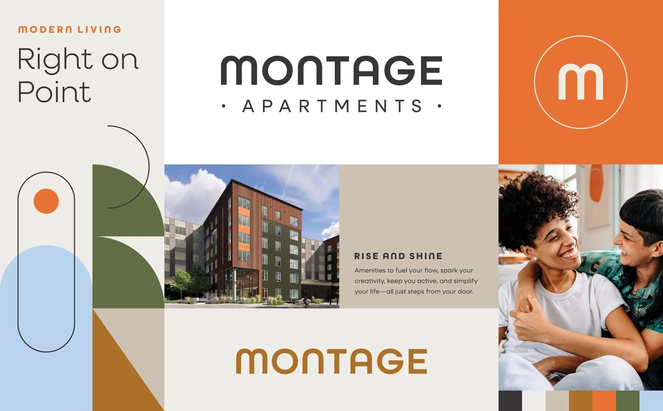
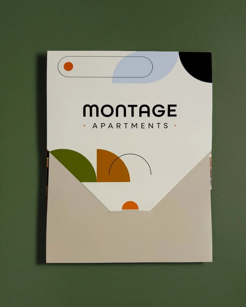
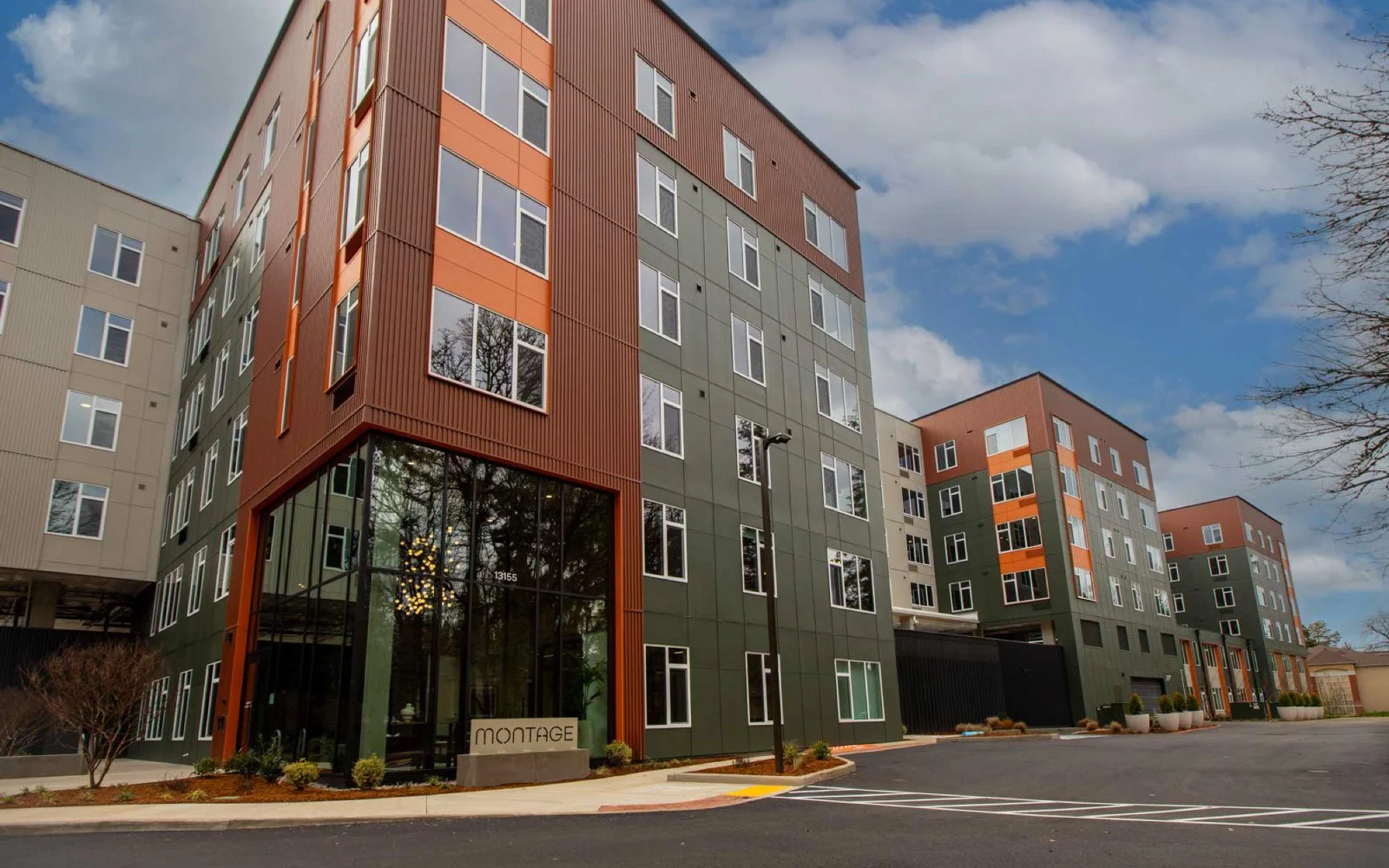
Montage
Bringing Life to the Triangle
Historically defined by big-box retail and office parks, the Tigard Triangle was evolving from a car-centric pass-through into a walkable urban neighborhood—creating a rare opportunity to stand out in a competitive multifamily market as one of the region’s most connected locations.
We were brought on to craft a brand identity for a new mid-rise multifamily campus that would leverage the transformation and support early lease-up in an emerging market.
Development Team
Fore Properties
Sign Vendors
Elite Signs
Meyer Sign Co.
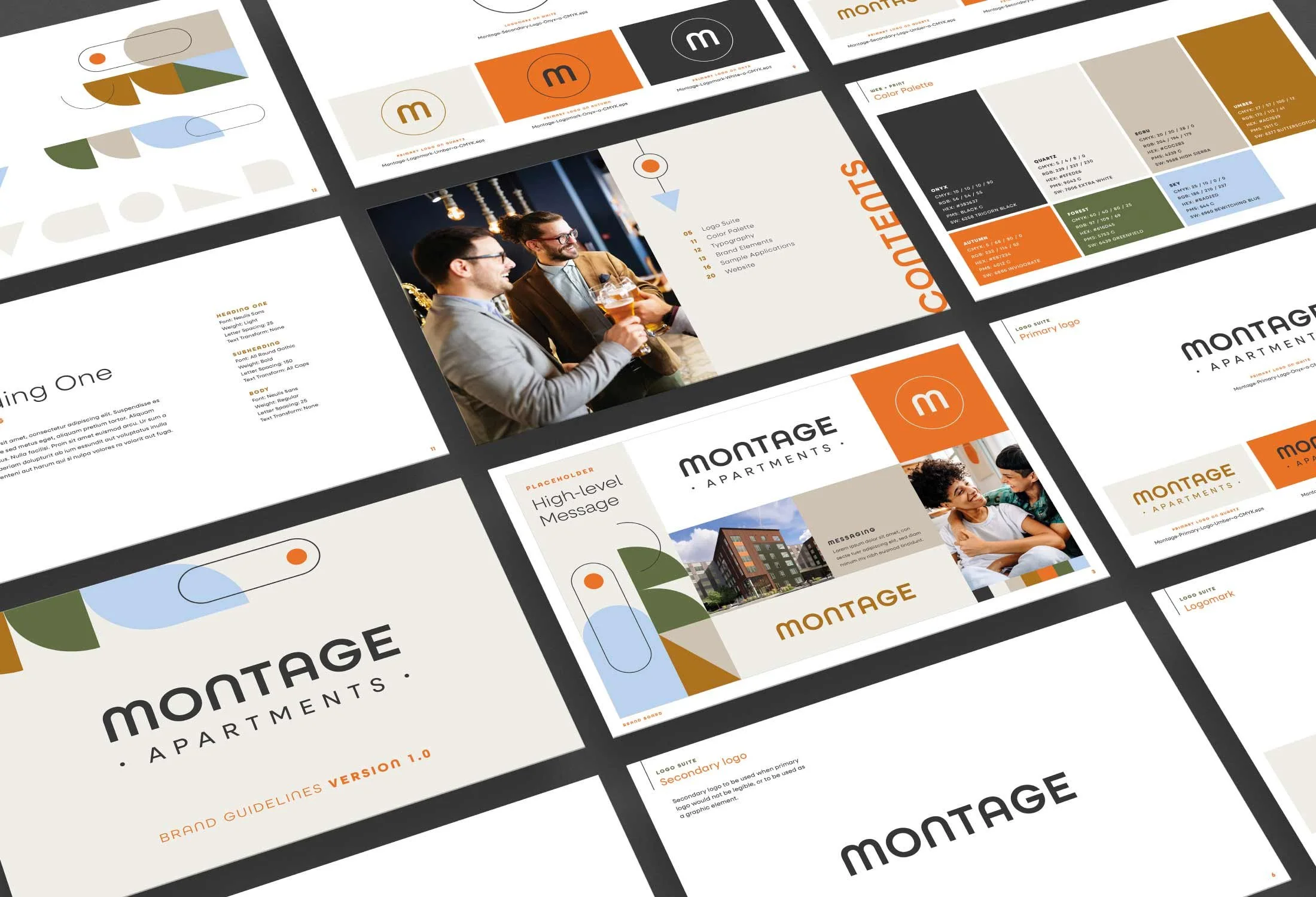
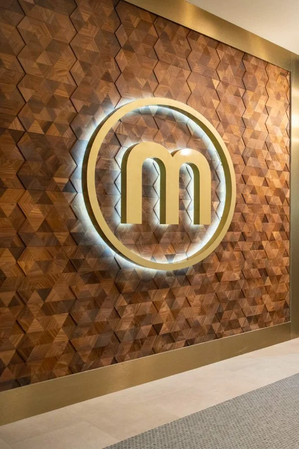
A Balanced Duality
“Montage” became both the name and an organizing idea. A composition of city energy and suburban ease positions the brand as connected, elevated, and distinctly Tigard. It also gave us a way to speak to both conditions at once — the calm, tucked-away quality of the entrance and the pace of residents moving between Portland, the suburbs, and beyond. We built the brand around that contrast: access without exposure, connectivity without compromise.
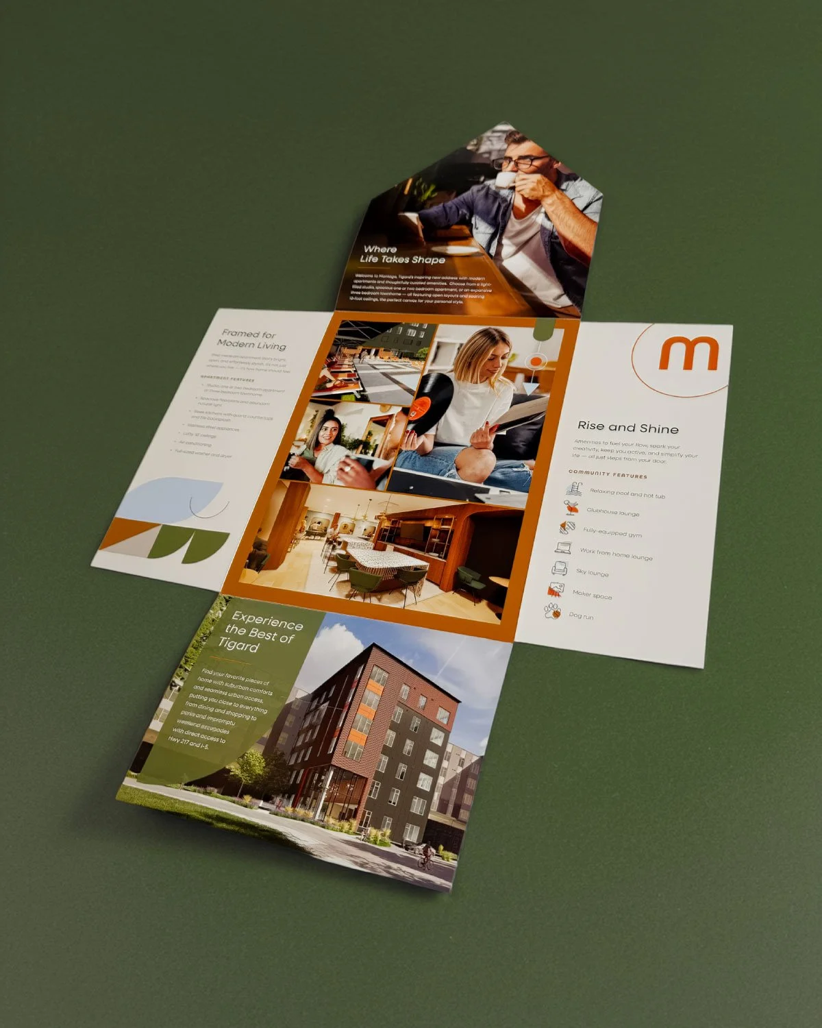
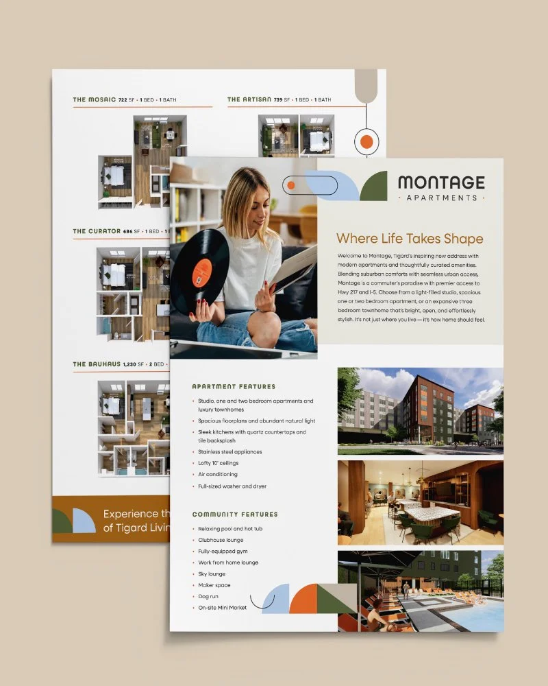
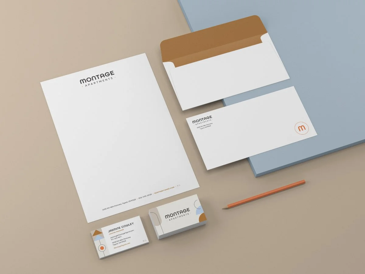
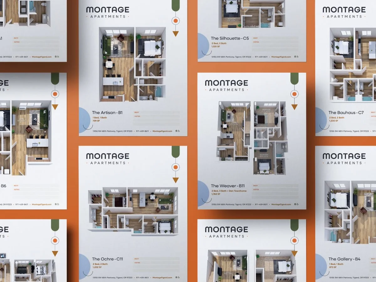
Marketing materials were designed as a system, rather than a set of one-offs. Floorplans, brochures, and stationery prioritize clarity and visual cohesion. Information is easy to navigate, but never stripped of tone — maintaining a sense of quality at every step in the decision process.

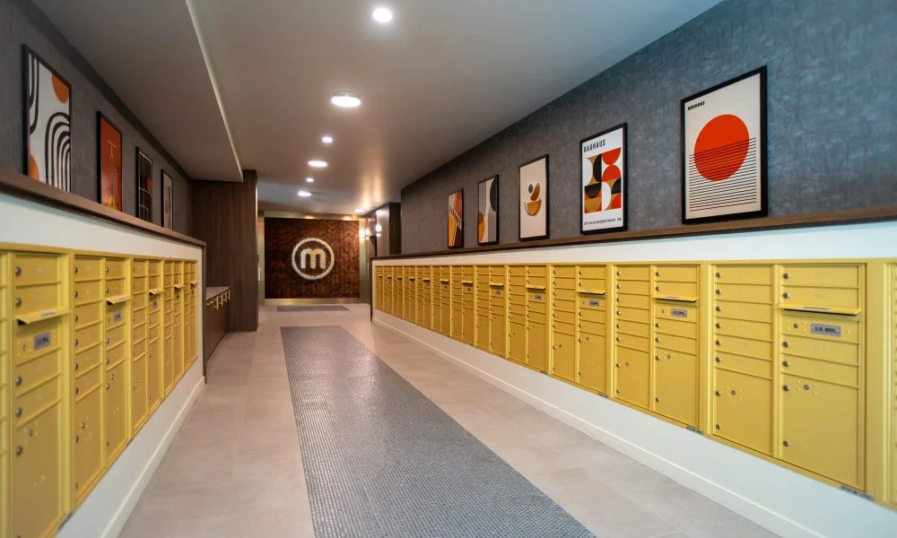
A Living Composition
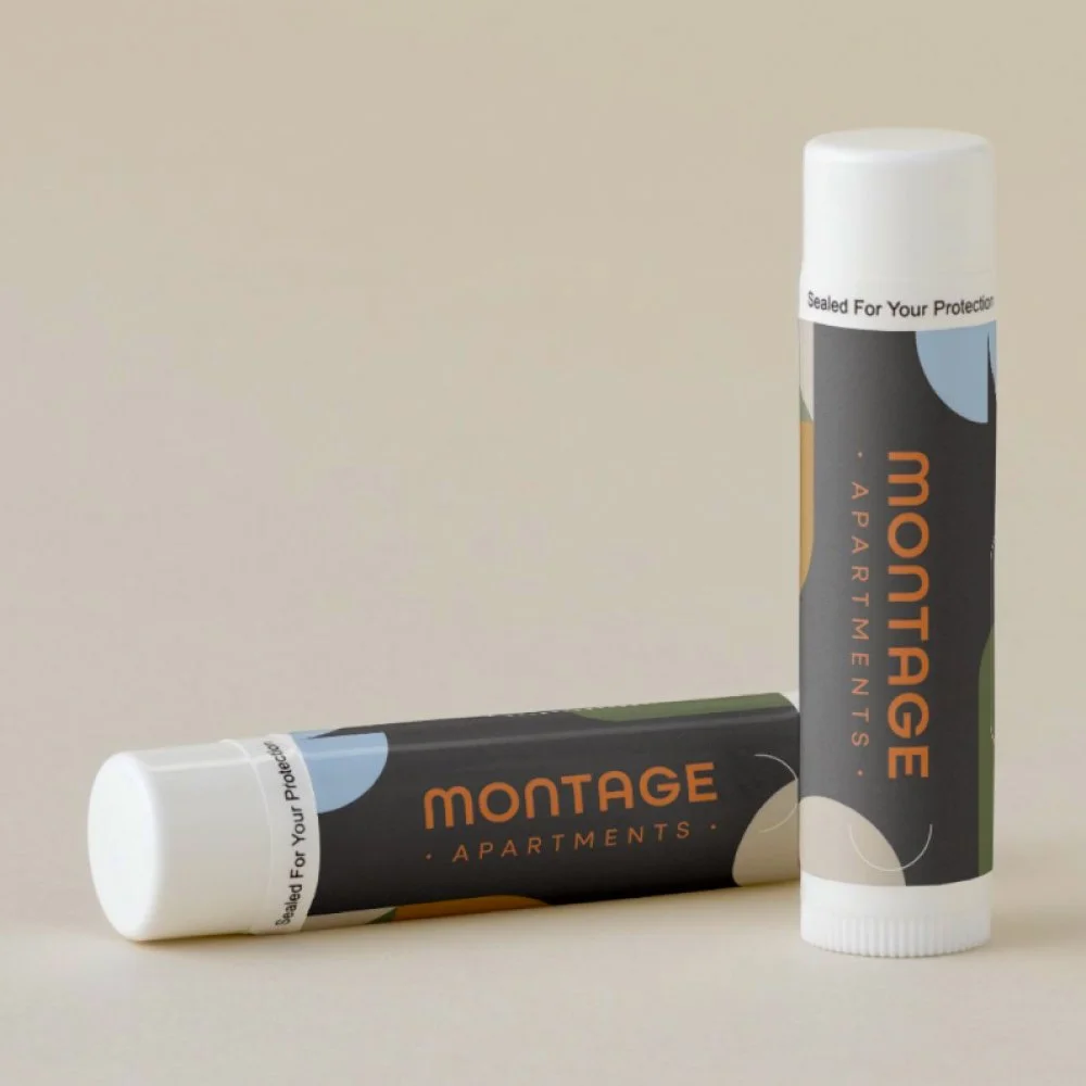
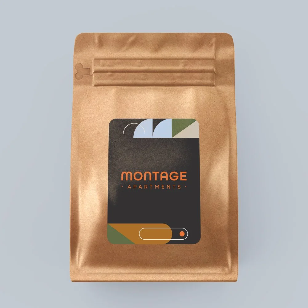
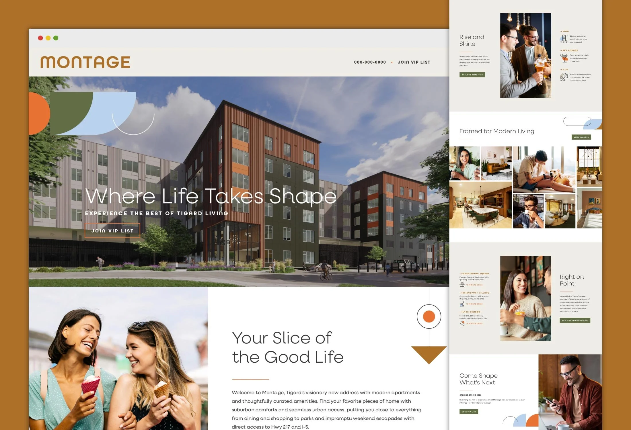
The identity system reflects the visual duality of the brand. Gentle neutrals and simple, organic shapes and typography establish a sense of calm livability, while punctuated color introduces structure, visibility, and energy.
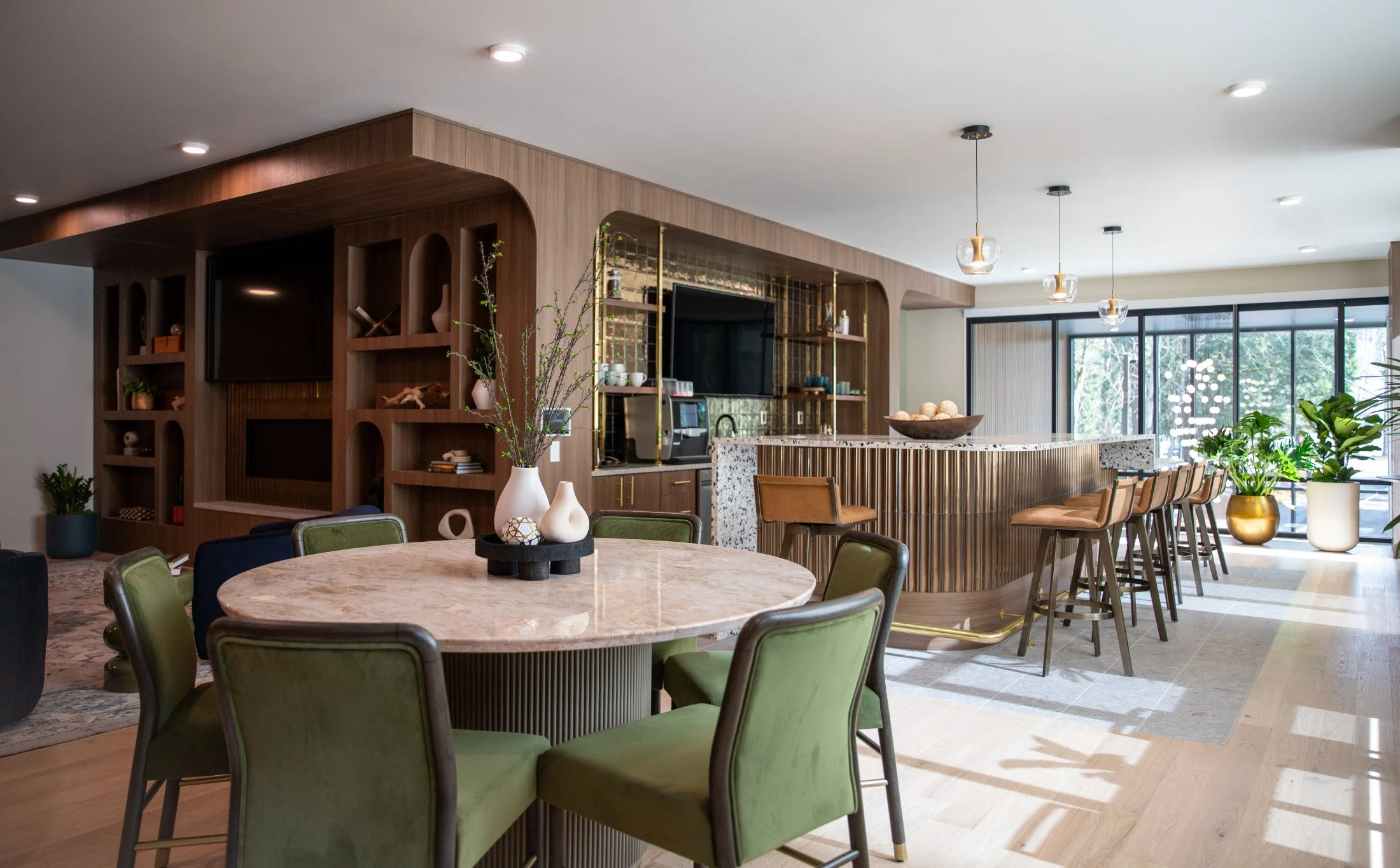
Where Form Meets Flow
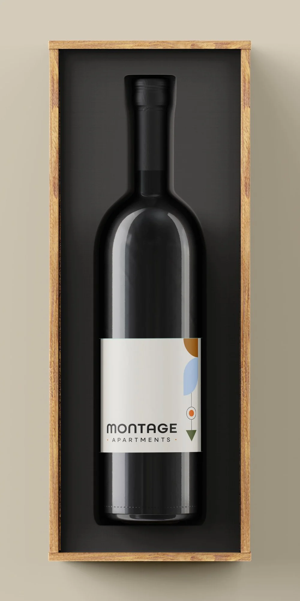
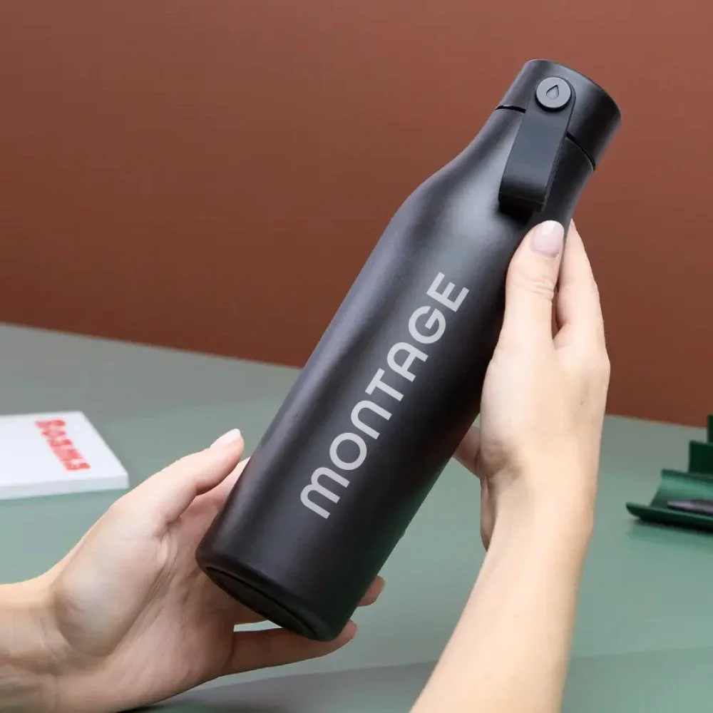
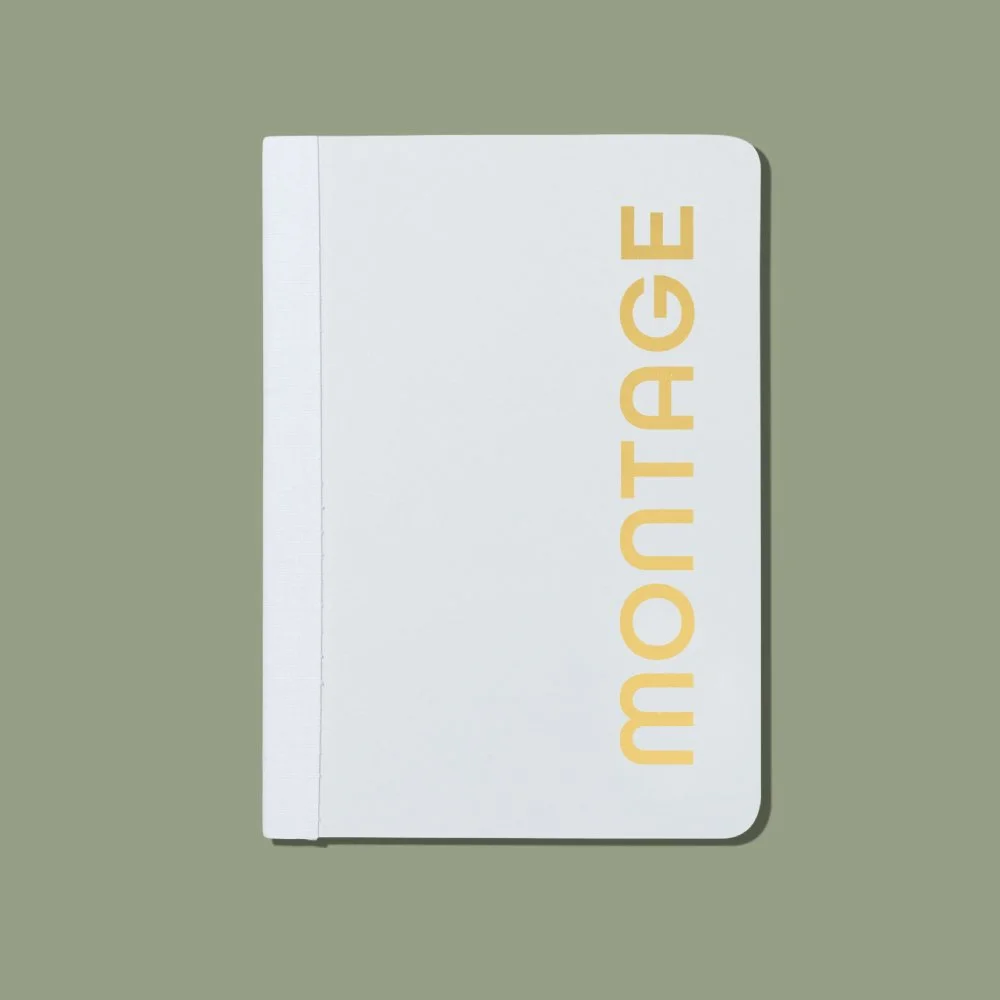
Move-in gifts cement the lifestyle at Montage into residents’ daily lives, creating small but meaningful moments of connection that reinforce place and build long-term affinity.
Direct, legible, and conversion-focused, the website is designed to move users toward action without friction. Messaging balances aspiration with clarity — positioning Montage as an attainable life upgrade.
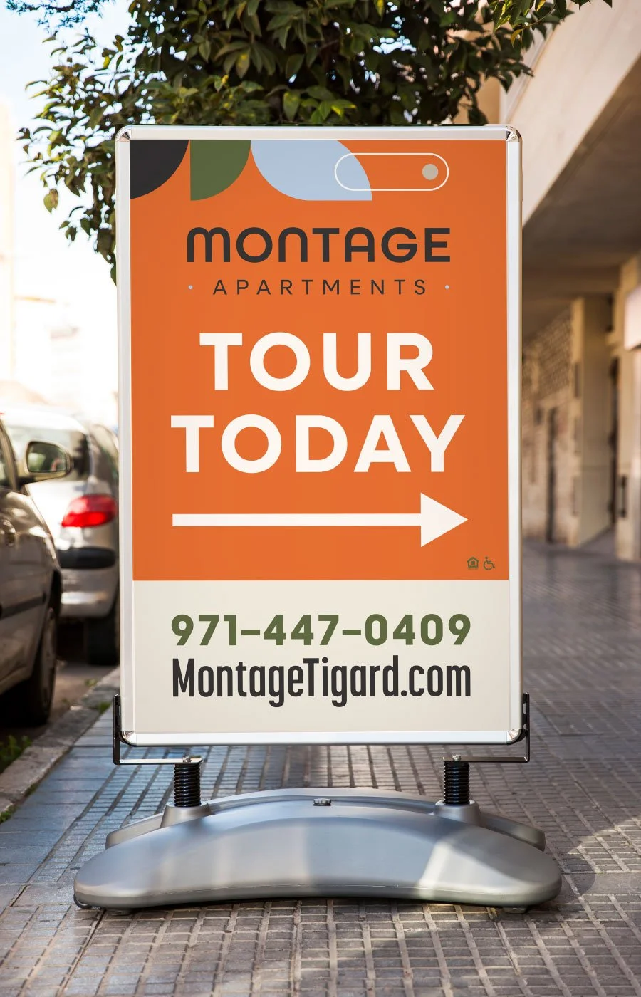
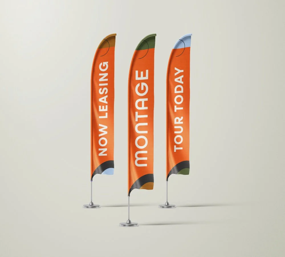
Capturing Attention at Every Speed
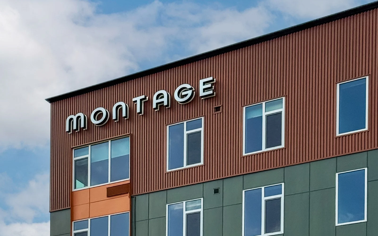
Given its location, signage needed to perform at all speeds: fast from the freeway and slow at street level. At a distance, bold contrast and clear messaging cut through the noise. Up close, the color, spacing, and typography work together to capture attention and spark interest.
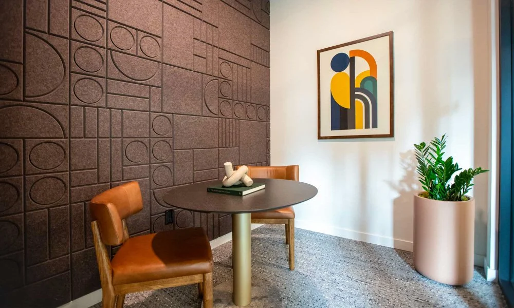
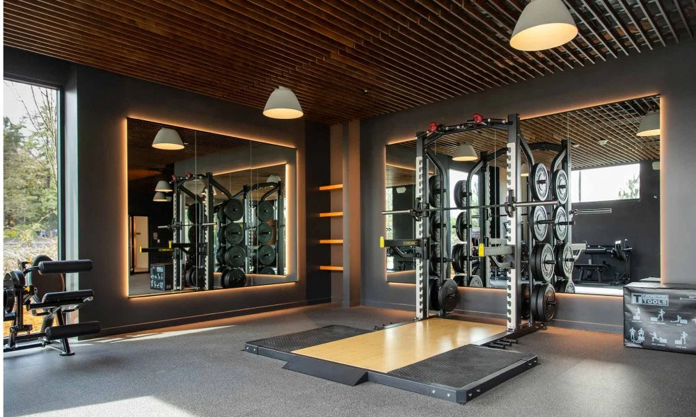
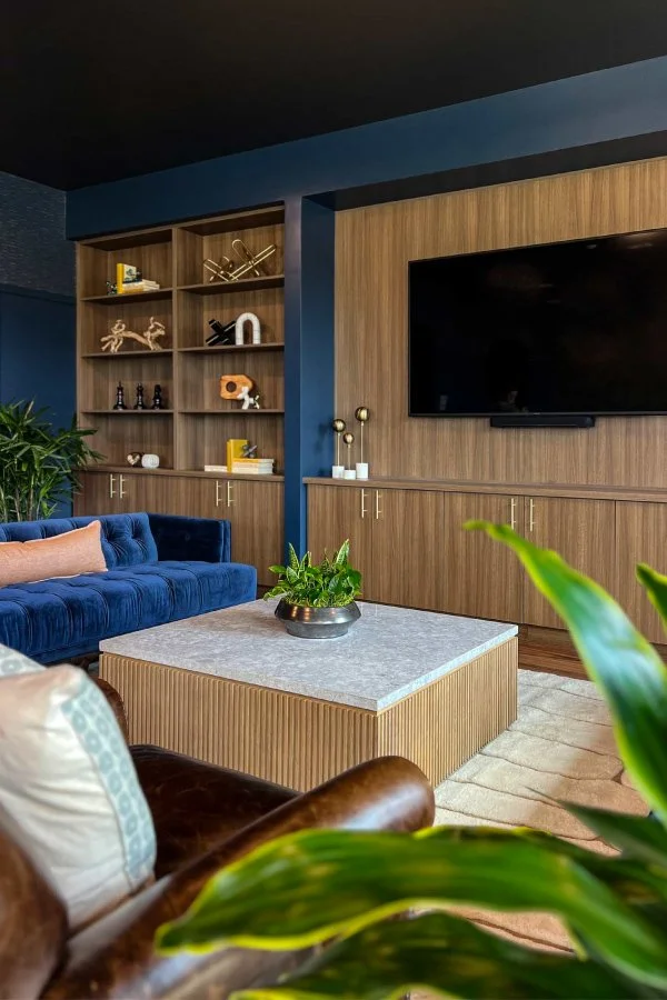
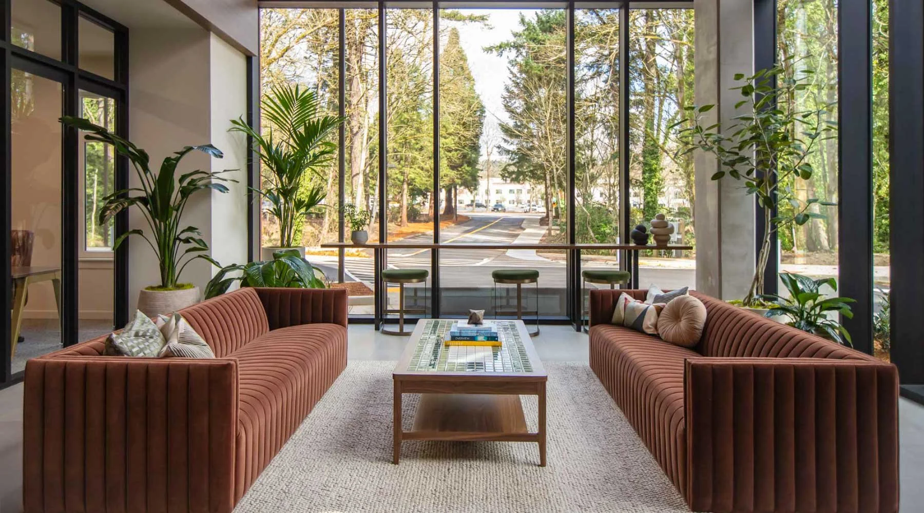
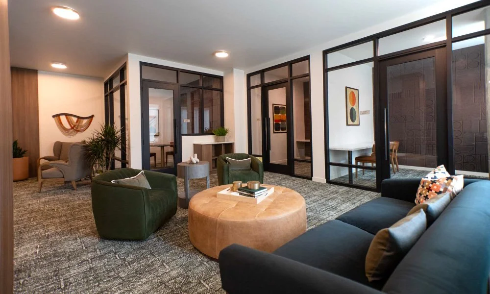
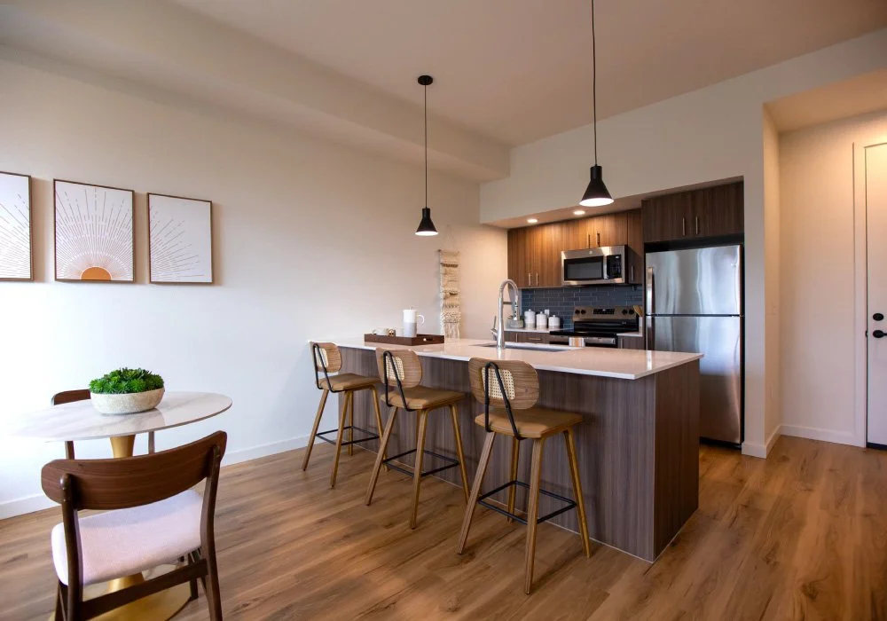
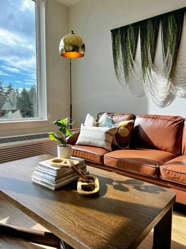
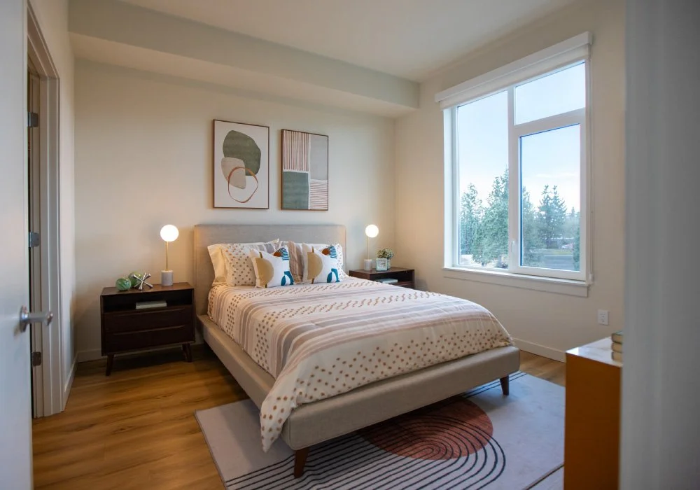
Frame by Frame
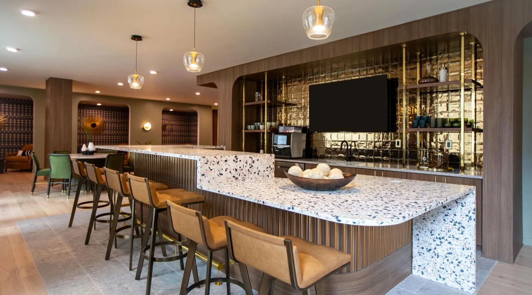
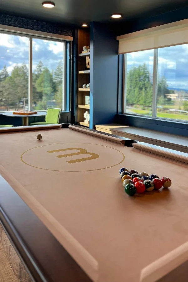
We captured a full suite of imagery for print and digital use, highlighting Montage’s livability and reinforcing its quality and lifestyle through curated spaces designed to be lived in and loved.
From Pass-Through to Place
The result is faster lease-up, clearer differentiation in a crowded market, and a perception shift that turns a once-overlooked area into a place people choose to live. When branding changes how a property is experienced, it doesn’t just lease units — it unlocks the full potential of the project and sets a higher benchmark for everything that follows.