

Services: Brand Strategy, Collateral Materials, Copyediting, Environmental Design, Logo & Identity, Messaging, Naming, Signage & Wayfinding, Website
Willow
A Fresh Approach to Home
Positioned along tree-lined streets on the outskirts of Lake Oswego, Willow Apartments is a new multi-family property with a Nordic-meets-Modern-Farmhouse design and a Pacific NW twist. Offering a balance of suburban tranquility and urban accessibility, we crafted a brand to attract working professionals, commuters, and young families.
Collaborators
Greystar
Forge Graphic Works
Meyer Sign Co.
Development Team
Shorenstein Properties
Design/Build
GBD Architects
Deacon
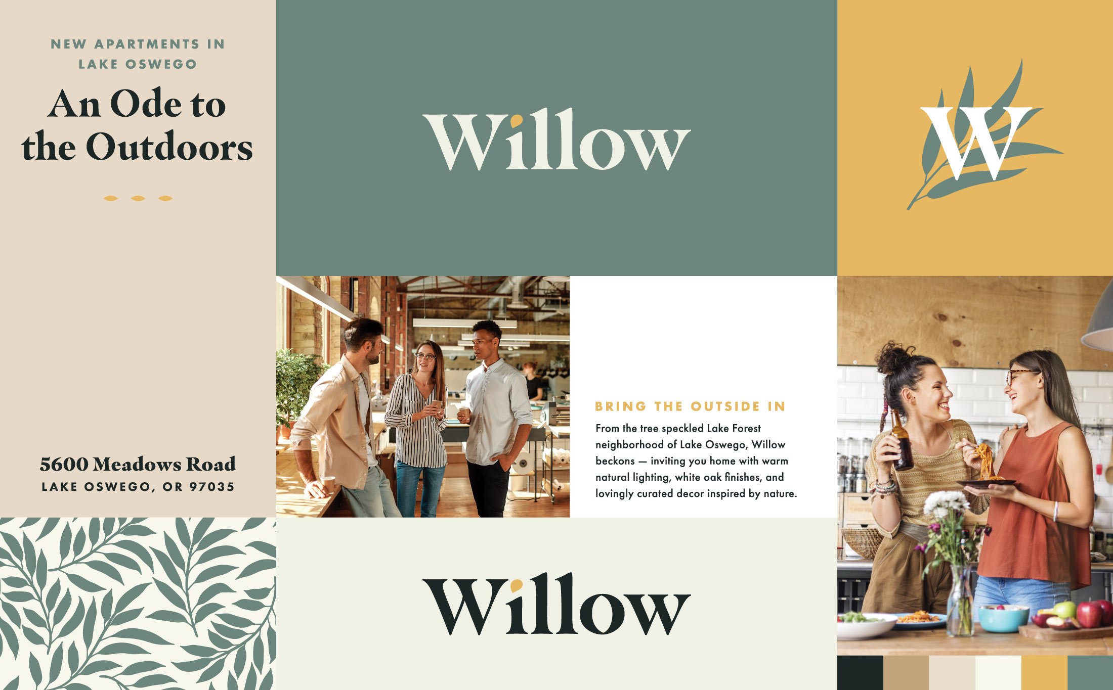

A Breath of Fresh Air
Rooted in the natural beauty that surrounds it, Willow’s brand identity with organic typography, gentle greens and creamy neutrals evoke a feeling of calm sophistication. Inspired by lush green spaces and winding creeks, the brand's marketing materials mirror the physical environment: organic, balanced, soothing.


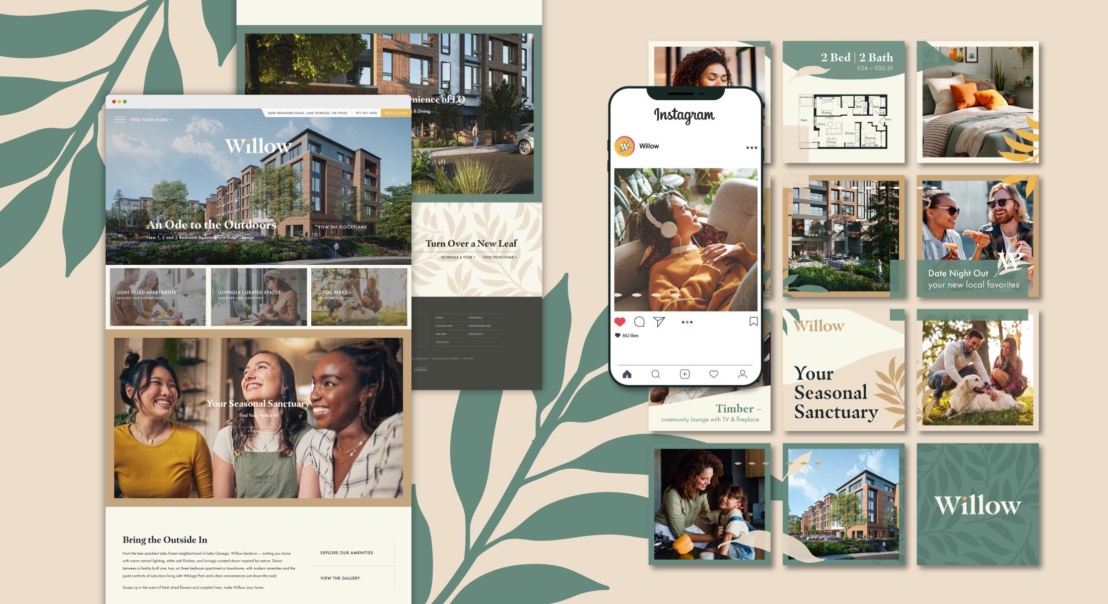
A Place to Grow
Willow took root with a sleek, responsive website that mirrors the energy of the physical space. Pairing the launch of the website with a social media campaign, we helped generate early interest and establish a strong first impression for future residents and surrounding businesses.
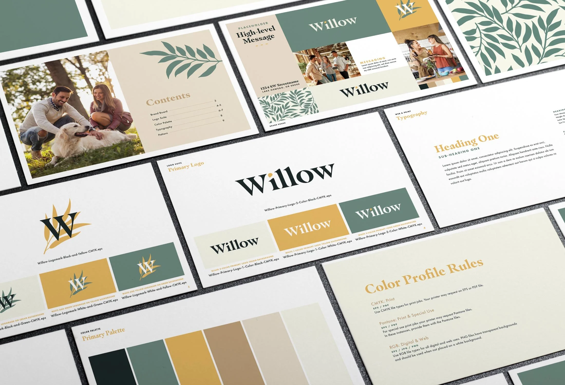


A Natural Guide
Working with local fabricators, we designed sleek exterior signage to catch light and curiosity with a modern monument and awning sign to anchor the brand upon arrival. Layering in wood textures, soft leaf patterns, and tree-inspired amenity names we gave a subtle nod to the brand on each floor, gently guiding residents and visitors through the space.
In the parking garage, we added a botanical-meets-industrial twist with bold graphics and mural-style treatments that brought warmth and character to concrete walls.


